I took the liberty to hijack the blog from BoyC to start a little skunk-work series of tech-articles about the stuff that goes on behind the curtains in Perpetuum. There's some fairly unusual ideas and solutions we came up with over the years and I hope they're as interesting to you as they were for us to invent / implement. (Or well, potentially more interesting, and without the malnutrition / hangover / sleep deprivation.)
So, maps.
The main principle
What is the task at hand, what are the conditions we can work under?
- We need to have a map in the game where players can see the main navigation points. The goal is the map to look as good as possible within the given circumstances, since players will be staring at it for prolonged periods, and we don't want them to stuff their own eyes into the recycling facility 5 minutes into the first transport mission.
- We do not have expendable artists who can spend time on painting maps manually, but more importantly, unlike other games, the map here needs to be as accurate as possible, for strategic reasons.
- The terrain is a height-map - we can safely assume the client has access to this data, but this data has the possibility to change fairly often. (Think terraforming, either by players or by level design.)
- Not really a mission-statement as such, but resolution-independence is a plus.
Summed up, we need a fairly non-linear data flow coming from a 2D dataset, and ending up in a good looking texture. In other words, procedural textures. Luckily, we're fairly comfortable with that. (*wink* *wink* 64k *cough*)
The steps
Let's look at our starting dataset first:
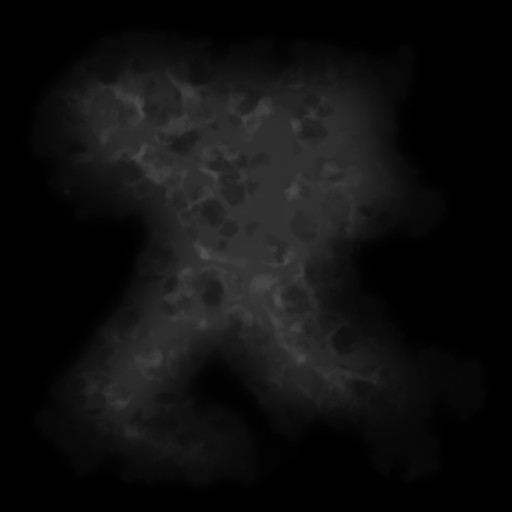
This is the actual terrain height-map, a 2048x2048 2D dataset of 16-bit height values. The reason it looks so dark is because this is a linear mapping of the 0..65535 range to the 32 bit colors available on your screen. Given that we don't really have to care about the peaks so much, since robots can rarely pass those, we can re-map the range of interest between two completely arbitrary values following "This Looks Good Enough"-principle, ideally somewhere around the water level for the low value, and the highest walkable point on the map for the high value.
This already looks a lot more usable. Sure, the mountain peaks become a big white spot, but we don't have to concern ourselves with those because they're rare, usually uninteresting for the player, not to mention the strange yodeling sound they emit.
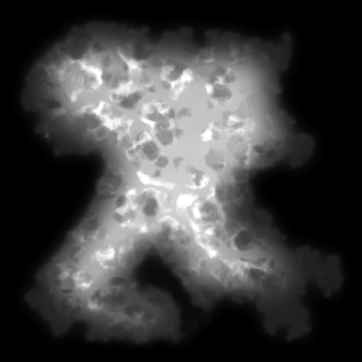
It's time to add color. Cartographers generally follow a principle where they assign certain colors to certain heights, which works perfect for us, because we can use a look-up table internally to do so. This look-up table, in our case (and ideally), is a simple 256 pixel wide bitmap, painted by a graphics artist:

So if we use this to color up our altitude levels, we get this:
This almost looks good enough and no-one would blame us if we'd stop here (no, you wouldn't, shut up), but we knew we could do something more interesting given the data at hand a little maths. The image already has a nice faux-natural quality to it, but it needs contrast, the same way maps often have a little lighting / shading on them.
Adding contrast
At this point, the idea was to take the altitudes, more specifically the altitude-differences (or slopes), and turn them into shading. For this, what we've done is an implementation of what generally bitmap-manipulation software call as "Emboss", and basically means taking surrounding pixels, and calculating a normal vector out of them. Many of you might wonder if it means we're calculating a normal map, and in one sense yes, but the trick here is that the direction of the light can be fixed, because why not, it's Good Enough, and that allows us to speed up the calculations simply by assuming that the light always comes straight from the left.
For less technical minded: This practically could mean that we start walking (figuratively speaking) from left to right on every row of pixels, and if the next pixel is a point higher, we get a bright point, if it's lower, we get a dark point. (If you're indeed a code-savvy person, please refrain from gnawing out your own cerebrum at this stage because of this rather sloppy explanation, I was trying to make a point here.)
If we take this normal value and map it (with a bit of magic number wizardry) to the grayscale color range of 0..255 (0 meaning the next pixel was lower, 255 meaning higher, 128 meaning it was the same level), we get this:
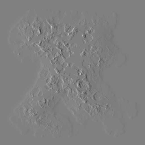
Not the prettiest of pictures, but it's a vital component towards what we want: contrast.
So we have a colorful picture with no contrast, and we have essentially a bump map with no colors - how do we blend the two without calculating lighting on every pixel?
Simple: Prepared lookup-tables. We know we have 256 levels of color, and we know we have 256 levels of contrast, so we can pre-calculate a 256x256 pixel lookup table with all the possible combinations and utilize that to render the final image:

This lookup-table is ostensibly the above gradient, with the top half fading to black and the bottom half fading to white. Between that, in the very center, is our original gradient.
All it remains now is to run the following little lookup, matching our color and contrast:
- for every pixel {
- tx = get_remapped_altitude() // 0..255
- ty = get_contrast() // also 0..255
- final_color = shaded_gradient_lut(tx,ty)
- }
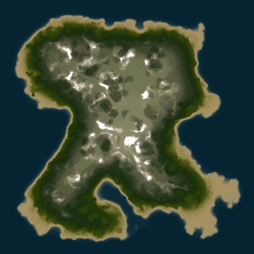
And here's our final image:
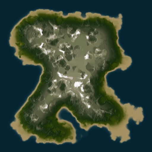
The difference is subtle, but definitely visible when the maps are zoomed up close - which is what will happen in most cases.
The advantages of this method are manifold: it's fairly fast (it's entirely fixed point arithmetics), it's resolution-independent, it looks Good Enough, and most importantly, it's responsive to the level of immediacy, i.e. every change done on the map can be rapidly re-rendered on the map as well. (This also goes for the passable terrain calculations, but that's a whole new story.)
That concludes our first visit to the forsaken wretched nadirs of the Perpetuum codebase. I'm not sure what to write about next time, but I suppose a quick look at the "number of changes per line of code" graph will quickly indicate where the "interesting" bits in our code are.